
The best medical website designs are built around the visitor's first question and a two-tap path to booking. They state specialty and location immediately, surface insurance, referral or intake details, and meet Google's Core Web Vitals, accessibility and HIPAA-safe form standards.
- Design the homepage around your typical patient's first question: insurance, referral, intake or urgency.
- Repeat a tap-to-call number and booking button; give multi-location practices a location picker.
- Meet Core Web Vitals on mobile: LCP 2.5 s, INP 200 ms, CLS 0.1 at the 75th percentile.
- Section 504 requires WCAG 2.1 AA for HHS-funded practices by May 2027 or May 2028.
- Keep ad pixels and session recording off every booking, intake and contact form.
What makes a medical website design effective in 2026?
An effective medical website design gets the right patient to the right next step with the least effort. It states the specialty and location in the first screen, makes calling or requesting an appointment obvious on a phone, explains insurance and the referral process, and proves expertise with real physicians and real patient education.
That definition changes by specialty. A retina practice gets most patients by referral, so the site has to reassure someone who was just sent there by another doctor. A hospice provider is talking to a frightened family member. An ABA clinic is speaking to parents trying to understand insurance and intake. The best designs are the ones that know exactly who is reading.
For this roundup, we reopened every site from our older healthcare-website lists in October 2026 and reviewed each live homepage again. We describe only what is visible on each site today, and we cut the sites that had gone stale.
- Confirm specialty
- Check insurance
- Trust physicians
- Book or call
Which healthcare websites show strong design across specialties?
These eight sites span retina surgery, podiatry, optometry, ABA therapy, dentistry, hospice and senior living. Each shows a specific design decision worth copying. Open them on your phone and compare them with your own homepage.
1. The Retina Partners (retina surgery, Los Angeles area)
The Retina Partners opens with a clear statement of scope: its physicians are eye surgeons who specialize in retinal disorders, board certified with two years of retina fellowship training. The page acknowledges that many patients arrive by referral, and a “Referring Doctors” section sits in the main menu.
Five office locations are listed with their own direct phone numbers plus a toll-free line, and a click-to-call number sits in the top bar. Six physicians appear with linked profiles, and condition summaries for diabetic retinopathy, macular degeneration and retinal detachment link to deeper pages. Clinical trials have their own section, a strong credibility signal for a subspecialty practice.
2. Premiere Pointe Podiatry (podiatry, Dickinson, TX)
Premiere Pointe Podiatry leads with a patient outcome, “Get Back on Your Feet—Without the Pain,” instead of a list of procedures. “Book Online” appears in the header, the welcome section, the insurance block and again near the bottom, and it links to online scheduling.
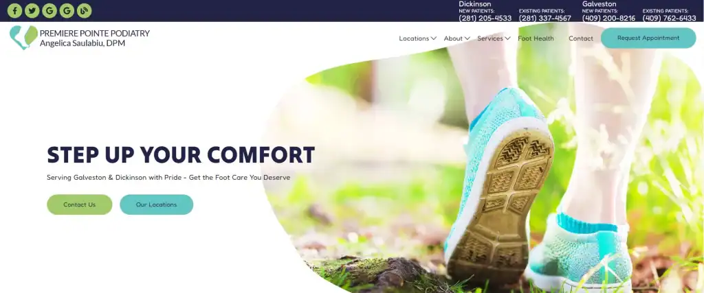
A “New patient? Start here” block gives first-time visitors a single entry point. New and existing patients get separate phone numbers in the top bar. The homepage names the nearby communities it serves and includes a “Foot Health” education section for people still researching symptoms.
3. Karen J. Solofsky, OD (optometry, Mays Landing, NJ)
Karen J. Solofsky, OD shows how much a small single-doctor practice can do with a clean layout. “Insurances” is a top-level menu item, and the homepage displays logos for more than a dozen vision and medical plans, including Medicare, so patients can confirm coverage without calling.
“Schedule Appointment” appears in the header and near the location section. A five-question FAQ answers routine questions, the menu links to the practice’s Google reviews, and hours are listed for every day of the week. It is a good model for any optometry or primary care office that runs lean.
4. Achievement Behavior Services (ABA therapy, NY, NJ, CT, GA and NC)
Achievement Behavior Services turns a confusing process into four steps on the homepage: contact, insurance, assessment, therapy. For parents new to autism services, seeing the path laid out lowers the barrier to reaching out.
The call to action is specific to the audience. “Enroll Now!” sits in the header, and “Request an Intake!” repeats after the services, in the FAQ area and near the end. Insurance logos and an FAQ that names accepted plans answer the first question most families ask, and in-home versus center-based care each get their own card.
5. Grateful Care ABA (ABA therapy, multi-state)
Grateful Care ABA puts a state selector and lead form right in the hero, which suits an organization with clinics across several states. Calls to action are concrete: “Start intake,” “Schedule a callback” and “Verify my insurance.”
“Verify my insurance” is a smart choice for this specialty, because coverage is often the deciding factor for families. The site also offers a “Refer a Patient” path for providers, and its cookie banner gives visitors accept, reject and preference options.
6. Bethesda Row Dental (dentistry, Bethesda, MD)
Bethesda Row Dental is the dental pick in this mixed list because it handles a fee-for-service model openly. Its FAQ includes pages titled “Why Would I Choose a Dentist That Doesn’t Accept Insurance?” and “Is Fee-for-Service Dentistry Worth It?” and the menu links to a membership plan.
“Book Online” sits in the top navigation, and a “Request an Appointment” button links to an online scheduling page. New and existing patients each have a tap-to-call number at the top of the page. A homepage quote from the dentist and a “We never charge extra for comfort!” callout give the practice a distinct voice. For more dental examples, see our roundup of the best dental websites.
7. LilyCare (hospice, NJ, NH and NM)
LilyCare shows how tone drives design in sensitive care. The hero, “Kind People, Comforting Care,” is calm and plain, and the key content link is “When to Consider Hospice,” which answers the question a worried family is actually asking.
Each state has its own click-to-call number in the header and mobile menu. Family testimonials praise specific roles (nurses, aides, chaplains) and round-the-clock support, and accreditation badges sit near the footer. The one gap we would close is a stronger contact or “request a call” button in the hero.
8. 428 Healthcare (senior living and skilled nursing, Florida)
428 Healthcare operates several assisted living and nursing facilities, and its design makes the locations the center of the journey. The hero button is “See Our Locations,” and each community is listed in the main navigation.
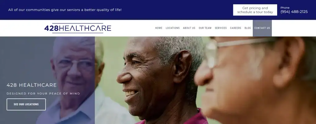
The top of the page carries a specific, decision-stage call to action: “Get pricing and schedule a tour today.” An amenities list describes daily life in plain terms, and five Google reviews from families appear on the homepage. Senior care families comparison-shop, and this site is built for that.
How do website design needs differ by specialty?
The core rules are universal, but the first question a visitor brings is not. Design your homepage around the question your typical patient or family asks first, and put the answer above the fold.
| Specialty | Visitor’s first question | What the homepage must surface | Example above |
|---|---|---|---|
| Retina, ophthalmology and other surgical subspecialties | “Is this the right specialist for what my doctor found?” | Scope of practice, physician credentials, conditions treated, referral path | The Retina Partners |
| Podiatry, physical therapy, chiropractic | “Can they fix my pain, and can I get in soon?” | Outcome-led headline, online booking, conditions list | Premiere Pointe Podiatry |
| Optometry and primary care | “Do they take my insurance?” | Accepted plans, hours, schedule button | Karen J. Solofsky, OD |
| ABA and behavioral health | “How does intake work and will insurance cover it?” | Step-by-step process, insurance verification, intake CTA | Achievement Behavior Services, Grateful Care ABA |
| Hospice and senior care | “Is it time, and who will care for my parent?” | Plain-language guidance, local phone numbers, family testimonials, tours | LilyCare, 428 Healthcare |
If you run an optometry practice or a podiatry practice, our specialty teams build homepages around these exact visitor questions.
What makes a healthcare website convert in 2026?
A healthcare website converts when it is fast on mobile, lets patients act in one or two taps, works for people with disabilities, keeps health information off ad platforms, and uses structured data that matches the page. These are not opinions; each has a published standard you can test against.
Meet Core Web Vitals on mobile
Google’s “good” thresholds are a Largest Contentful Paint within 2.5 seconds, an Interaction to Next Paint of 200 milliseconds or less, and a Cumulative Layout Shift of 0.1 or less, all measured at the 75th percentile of real page loads, with mobile and desktop judged separately (web.dev, 2024). Heavy sliders, autoplay video and stacked chat and review widgets are the usual reasons medical sites miss.
Design the booking path for a thumb
Every site above repeats its main call to action several times. On mobile, keep a sticky call or book button visible, make every phone number tap-to-call, give multi-location practices a location picker, and keep request forms to the fields the front desk truly needs.
Treat accessibility as a requirement
The Department of Justice says ADA Title III covers businesses open to the public and cites WCAG as helpful guidance, calling out online forms that cannot be filled out or submitted as a barrier (U.S. Department of Justice, 2022). If your practice receives federal financial assistance, such as Medicaid, HHS’s Section 504 rule requires WCAG 2.1 Level AA; a 2026 interim final rule set compliance for May 11, 2027 (15 or more employees) and May 10, 2028 (fewer than 15) (HHS interim final rule, Federal Register, 2026).
Keep tracking off patient forms
HHS has stated that tracking on appointment-scheduling and symptom-checker pages may disclose protected health information to the tracking vendor (HHS Office for Civil Rights, 2024). A June 2024 court ruling vacated part of that bulletin, but the practical rule for practices is the same: no ad pixels or session recording on booking, intake or contact forms, and secure forms that keep health details out of ad and analytics tools. See our HIPAA-compliant forms.
Use specific, accurate schema
Google requires name and address for LocalBusiness markup, recommends phone, URL, hours and coordinates, and asks you to use the most specific subtype available (Google Search Central). For AI Overviews and AI Mode, Google says no special schema is needed; standard SEO applies and structured data should match visible content (Google Search Central).
Should a practice redesign its website or refresh what it has?
Refresh first if the site is fast, mobile-friendly and easy to update; redesign if it fails Core Web Vitals, cannot support online booking or secure forms, or no longer reflects your services. A refresh fixes content and calls to action. A redesign fixes the foundation.
When we reviewed the older lists for this article, several once-strong sites had drifted. One showed a COVID-19 reopening notice and a 2023 copyright. Another had test captions left in a photo gallery. One domain now shows only a placeholder page. None of these needed a redesign. They needed someone checking the live site every month.
- Refresh when the problems are content: outdated banners, missing hours, old photos, weak headlines, buried booking buttons.
- Redesign when the problems are structural: slow templates, no mobile layout, forms that cannot be made HIPAA-safe, or a CMS your team cannot edit.
Our medical website design team can tell you which one you need after a short review.
What should you fix on your practice website this month?
Use this checklist on your phone, not your desktop. Most practices can clear half of it in an afternoon, and every fix makes the next ad dollar or referral more likely to turn into a booked visit.
- Confirm your specialty and city appear in the first headline a visitor sees.
- Check that a tap-to-call number and a book or request button are visible without scrolling.
- Test LCP, INP and CLS in PageSpeed Insights for your homepage and booking page.
- Submit your own appointment request and confirm it reaches the right inbox fast.
- Verify that no advertising pixels load on any form page.
- Complete your booking form using only a keyboard; fix missing labels and unclear errors.
- Remove expired offers, pandemic-era notices and placeholder text.
- Answer your visitors’ first question, whether insurance, referrals or intake, on the homepage.
Common questions
What makes a good healthcare website design?
A good healthcare website states the specialty and location immediately, makes calling or booking possible in one tap on a phone, introduces real physicians with credentials, answers insurance and referral questions, and loads fast. Visual style should support trust and clarity, not compete with them.
How many calls to action should a medical website have?
One primary action, repeated. Most strong sites place the same book or call button in the header, under the hero, mid-page and in the footer. Secondary actions such as patient forms, bill pay and portal login belong in a utility bar so they do not compete with new-patient booking.
Is it safe to use Google Analytics or Meta Pixel on a medical website?
Not on pages where patients enter health information. HHS has warned that tracking on scheduling and symptom-checker pages may disclose PHI to vendors. Keep advertising pixels and session-recording tools off forms, and use HIPAA-compliant forms for any page that collects health details.
When is the Section 504 website accessibility deadline for medical practices?
For practices that receive federal financial assistance from HHS, a 2026 interim final rule set compliance with WCAG 2.1 Level AA for May 11, 2027 for recipients with 15 or more employees, and May 10, 2028 for those with fewer than 15.
Do medical websites need schema markup for AI search?
Google says no special schema is required for AI Overviews or AI Mode. Standard SEO applies. Accurate LocalBusiness markup with the most specific subtype, plus consistent name, address, phone and hours, still helps search engines understand your practice, so long as it matches what is on the page.
How much content should a specialty practice homepage have?
Enough to answer the first question and point to deeper pages. Strong examples include a short scope statement, condition or service summaries that link onward, physician introductions, location details and a few reviews. Long-form education belongs on dedicated condition and procedure pages.