
The best dental websites make it effortless to call or book from a phone. They show the phone number and an appointment button in the header, answer insurance and financing questions on the page, introduce the real dentist, and load fast enough to meet Google's Core Web Vitals.
- Put a tap-to-call number and a booking button in the header and repeat both further down the page.
- Separate new-patient and existing-patient phone lines so new-patient calls are routed and measurable.
- State insurance, financing or membership plans on the homepage instead of making patients call to ask.
- Meet Core Web Vitals targets: LCP within 2.5 seconds, INP of 200 ms or less, CLS of 0.1 or less.
- Remove expired specials, old COVID banners and empty sections; stale content costs trust.
What makes a dental website one of the best in 2026?
The best dental websites answer three questions within seconds: what you do, where you are, and how to book. They put the phone number and an appointment button in the header, show the real dentist and office, explain insurance and financing plainly, and load fast on a phone.
Design still matters, but it is the wrapper, not the product. In our work with 3,200+ practices, the sites that bring in new patients are the ones that remove friction for a nervous, busy person holding a phone with one thumb. Visual polish helps that person trust you. A clear path to the schedule is what turns trust into a booked visit.
To build this list, we reopened every site from our older “top dental websites” roundup in October 2026 and looked at each live homepage again. We kept the ones that still work well and dropped the ones that had slipped. Everything we describe below is something you can see on the site today, not a feature we assumed.
- Search on phone
- Scan homepage
- Check insurance
- Tap call or book
Which dental practice websites are worth studying right now?
These eight general, cosmetic and implant practice sites each do at least one thing exceptionally well. Study the specific pattern each one shows, then ask whether your own homepage does the same. Links open the live sites so you can check them on your own phone.
1. Chadha & Co Dental (North Bethesda, MD)
Chadha & Co Dental repeats its phone number in four places: a top banner, the header, the contact section and the footer. “Request Appointment” sits in the header and the hero and links straight to an online booking page, with a booking badge at the very top of the page.
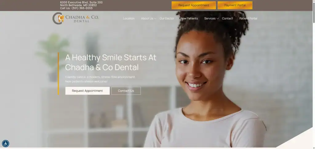
Small touches widen the audience. The header notes “Se habla español,” the navigation includes a “No Insurance? No Problem!” page for uninsured patients, and both a patient portal and a payment portal are one click away. The contact form includes a separate SMS consent checkbox rather than burying it in fine print.
2. Mountain View Dentistry (Bridgton, ME)
Mountain View Dentistry splits its header phone numbers into New Patients and Existing Patients. That is a quiet but powerful choice: new-patient calls go to the line staffed for them, and the practice can tell how many new-patient calls the site produces.
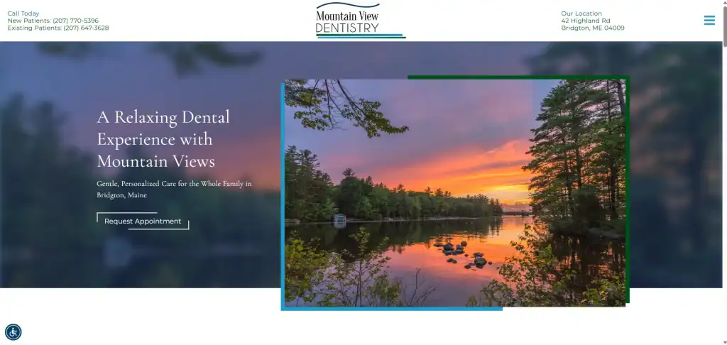
The hero, “A Relaxing Dental Experience with Mountain Views,” leans into the location instead of generic stock language. Three feature cards (“All in One Place,” “Gentle No-Judgment Care,” “Flexible Payments”) speak directly to common fears. The homepage states that the office accepts major insurance and CareCredit, and it promotes online bill pay with a QR code and a “Pay Bill” menu link.
3. Prestige Dentistry (Palm Harbor and Trinity, FL)
Prestige Dentistry shows how a two-location practice should handle booking. Instead of one generic button, the header carries “Palm Harbor Appointment” and “Trinity Appointment,” and both link to an online booking app. Each address has its own new-patient and existing-patient numbers.
The homepage is unusually transparent about money. It says the office is in-network with most PPO plans, lists accepted payment methods, names two financing options and promotes an in-house membership plan for uninsured patients. “Emergency” is a top-level menu item, so a patient in pain does not have to dig for it.
4. Chroma Dental (Midtown East, New York, NY)
Chroma Dental uses its hero to state scope in one line: cosmetic and restorative dentistry, orthodontics and oral surgery. A Manhattan visitor comparing several offices knows immediately whether this one handles their case.
“Before & After” and “Testimonials” are top-level menu items, not buried under About Us, and the homepage features a smile gallery. The Services menu is grouped into General, Restorative, Cosmetic, Orthodontics and Technology, which keeps a long service list scannable. “Request an Appointment” appears in the header and again in the intro.
5. DentaCrafters (Falls Church, VA)
DentaCrafters makes both its new-patient and existing-patient numbers tap-to-call links in the header, which is exactly what a mobile visitor needs. The hero headline names the city, “Experience Exceptional Dentistry in Falls Church,” with “Request Appointment” and “Contact Us” buttons directly beneath it.
The doctor introduction does real trust-building work. It explains that Dr. Nada Elsadig graduated from Howard and spent more than ten years as a registered dental hygienist before becoming a dentist. The homepage also gives full-arch implant patients their own section and lists Saturday hours, a selling point for working patients.
6. Restoration Dental (Oklahoma City and Edmond, OK)
Restoration Dental builds its main navigation around what it most wants to be known for: Implant Dentistry, Cosmetic Dentistry, General Dentistry and IV Sedation, followed by a “What To Expect” page. High-value services are one tap away, and an anxious patient can read what happens before committing.
Alongside “Request Appointment,” the site offers “Schedule Consultation,” which fits how implant patients actually buy. Both dentists get short bios with training details, a “Why Choose Us” card links to an Insurance & Financing page, and a patient-stories section labels each story by treatment type.
7. Lux Dental (Waterford Township, MI)
Lux Dental leads with the two reasons most people search for a new dentist: “Family & Emergency Dentistry in Waterford, Michigan.” “Book Now” appears in the top bar, header, hero and footer, and it opens an online appointment request flow.
The phone number repeats at the top, under the hero, in the office details and in the footer. Office hours are listed for every weekday, including a Wednesday evening until 7 p.m., and both dentists have short bios naming their dental schools. It is a simple site, and that simplicity is the point.
8. Addison Dental Studio (Addison, IL)
Addison Dental Studio puts two promises in its top bar: “Se habla español” and “We treat emergencies.” The hero repeats that emergency appointments are available, and “Book Appointment” appears in the header and throughout the page, linked to online booking.
Money questions get real answers. The homepage has a financing section, an FAQ that covers payment options, and an “Affordable Payment Plans” item in the main menu. An office-tour gallery lets a nervous patient see the space before they ever walk in.
What do the best dental websites have in common?
They share a short list of habits: the phone number is in the header, booking is reachable from the first screen, new and existing patients are routed separately, and payment questions are answered on the site rather than on the phone. None of these require a large budget.
| Pattern | Why it converts | Seen on |
|---|---|---|
| Separate new-patient and existing-patient phone numbers | Routes high-value calls and makes new-patient call volume measurable | Mountain View, Prestige, Chroma, DentaCrafters, Restoration, Addison |
| Online booking or request linked from the header | Captures patients who will not call during office hours | Chadha & Co, Prestige, Lux, Addison |
| Location-specific booking buttons | Stops multi-office patients from booking the wrong location | Prestige |
| Insurance, financing or membership plan stated on the homepage | Answers the most common question before the patient leaves | Mountain View, Prestige, Addison |
| Emergency care visible in the menu or hero | Captures urgent, ready-to-book searches | Prestige, Lux, Addison |
| Spanish-language note | Signals access to a large patient group in many markets | Chadha & Co, Addison |
Notice what is not on the list: animated effects, video backgrounds and clever taglines. Those can help, but they never replace the basics. If you want a site built around these patterns, our dental website design team starts with the booking path and works outward.
What makes a dental website convert in 2026?
A dental website converts when it is fast on mobile, lets patients book or request a visit in a few taps, works for people with disabilities, protects health information on forms, and tells search engines exactly who and where you are. Each of these now has a clear, published standard.
Hit Google’s Core Web Vitals
Google’s page-experience metrics have fixed targets. A “good” page shows its main content (Largest Contentful Paint) within 2.5 seconds, responds to taps (Interaction to Next Paint) in 200 milliseconds or less, and keeps layout shift (CLS) at 0.1 or less, measured at the 75th percentile of real visits on mobile and desktop separately (web.dev, 2024). Oversized hero sliders and stacks of third-party widgets are the usual culprits on dental sites.
Make booking a two-tap job on a phone
Every site on our list repeats its booking button and phone number in more than one place. On mobile, keep a sticky call or book button in view, make every number a tap-to-call link, and keep request forms short: name, phone, email, reason, preferred time.
Build for accessibility, not just for looks
The Department of Justice says the ADA’s Title III applies to businesses open to the public and points to WCAG as a helpful technical standard, naming inaccessible online forms as a common barrier (U.S. Department of Justice, 2022). Practices that receive federal financial assistance, such as Medicaid payments, also fall under HHS’s Section 504 rule, which adopts WCAG 2.1 Level AA; a 2026 extension moved compliance to May 11, 2027 for recipients with 15 or more employees and May 10, 2028 for smaller ones (HHS interim final rule, Federal Register, 2026). Our guide to ADA website accessibility for healthcare covers the details.
Keep forms HIPAA-safe
HHS has warned that tracking technologies on appointment-scheduling or symptom-checker pages can disclose protected health information to the vendor (HHS Office for Civil Rights, 2024). A federal court vacated part of that guidance in June 2024, but the safe course is unchanged: no ad pixels or session-replay scripts on booking or intake pages, and secure forms that encrypt submissions and keep health details out of ad and analytics tools, with your practice following its own HIPAA policies. That is what our HIPAA-compliant forms are built to do.
Add accurate schema markup
Google asks for the most specific LocalBusiness subtype, with name and address required and phone, URL, hours and coordinates recommended (Google Search Central). For a dental office that subtype is “Dentist,” which schema.org places under MedicalBusiness. Google also says there is no special markup needed for AI Overviews or AI Mode, only that structured data matches what is visible on the page (Google Search Central).
What mistakes keep good-looking dental websites from converting?
The most common mistakes are stale content and broken promises: expired specials, old pandemic notices, empty review sections and template text left on the page. Each one tells a visitor the site, and maybe the practice, is not paying attention.
We saw every one of these while rebuilding this list, and they are the reasons two sites from our earlier roundup did not make the cut. One displayed a new-patient special that had expired more than a year earlier. Another still led with a COVID-19 safety banner and had a stats strip with headings but no numbers.
- Expired offers. Put an end date on every special and a calendar reminder to replace it.
- Outdated notices. Remove pandemic-era banners and screening questionnaires unless your policy truly still requires them.
- Empty sections. If a reviews widget or counter fails to load, the heading sits over blank space. Check the live page on a phone, not just in the editor.
- Template leftovers. Placeholder captions such as “testing captions” or “Company Name” undercut an otherwise polished design.
- Mismatched locations. If your title tag says one city and your address says another, explain the service area clearly so patients and search engines are not confused.
How should you audit your dental website this month?
Spend one hour with your phone and this checklist. Fix the items that fail before you spend another dollar on ads, because paid traffic sent to a slow or confusing site is the most expensive traffic you will ever buy.
- Open your homepage on your phone over cellular data. Can you call or book within one tap from the first screen?
- Run the homepage and booking page through PageSpeed Insights and note LCP, INP and CLS against the 2.5 s, 200 ms and 0.1 targets.
- Submit your own appointment request. Time how long it takes and confirm who receives it.
- Confirm no advertising or analytics pixels fire on booking, intake or contact forms.
- Read every special, banner and date on the homepage. Remove anything expired.
- Tab through the booking form with a keyboard only. Every field should have a visible label and clear error messages.
- Check that your Dentist schema matches your name, address, phone and hours exactly.
- Make sure insurance, financing and emergency care are each answered on a page linked from the main menu.
If you want a second set of eyes, our dental marketing team reviews sites against this same list.
Common questions
What should be on a dental practice homepage?
At minimum: your phone number and an appointment button in the header, the city you serve in the main headline, your core services, a short dentist introduction with a photo, insurance and financing information, office hours, address with a map link, and recent patient reviews. Everything else is optional until those are in place.
Should a dental website offer online booking or a request form?
Real-time online booking captures patients who will not call, especially after hours. A request form is a reasonable fallback if your schedule needs front-desk control. Either way, link it from the header, keep the form short, and make sure someone responds the same business day.
How fast should a dental website load?
Aim for Google’s ‘good’ Core Web Vitals: main content visible within 2.5 seconds, taps answered within 200 milliseconds, and layout shift of 0.1 or less, measured on real mobile visits. You can check your numbers free with PageSpeed Insights or the Core Web Vitals report in Search Console.
Do dental websites need to be ADA accessible?
The Department of Justice says the ADA applies to businesses open to the public and points to WCAG as a helpful standard. Practices that receive federal financial assistance also face HHS’s Section 504 rule, which requires WCAG 2.1 AA by May 2027 or May 2028, depending on size. See our accessibility guide.
Can I put a Facebook or Google pixel on my appointment form?
We advise against it. HHS has warned that tracking technologies on scheduling pages can disclose protected health information to the vendor. Keep advertising and session-replay scripts off booking, intake and contact forms, and use a secure, HIPAA-aware form that keeps health details out of email and ad tools.
How often should a dental website be redesigned?
There is no fixed schedule. Redesign when the site fails Core Web Vitals, cannot support online booking, is hard to update, or no longer reflects your services and team. Between redesigns, review content monthly so specials, hours, photos and staff stay current.